Why does wearing red make you more attractive? How does makeup "work" at a neurological level? Why do certain colors make your skin glow while others wash you out? The answers lie in color psychology—the science of how colors influence emotion, perception, and behavior. From the neuroscience of facial contrast to the cultural symbolism of color, understanding color psychology reveals how beauty is constructed, perceived, and manipulated through color relationships.
This article explores cutting-edge research from 2024-2026 on color and beauty, including facial contrast theory, the red dress effect, seasonal color analysis, and how the brain processes color faster than facial features themselves.
What Is the Psychology of Color?
The psychology of color studies how colors influence human emotion, cognition, perception, and behavior. Color is not merely decorative—it's a powerful communication tool processed rapidly by the brain, often triggering emotional and physiological reactions before conscious thought.
In the context of beauty, color psychology operates on multiple levels:
How Color Shapes Beauty Perception
- Neurological level: Brain processes color 50-100 milliseconds faster than facial features
- Emotional level: Colors trigger automatic emotional associations (warmth, trust, excitement, calm)
- Cultural level: Color meanings vary by culture, shaping beauty standards globally
- Aesthetic level: Color relationships (contrast, harmony) determine visual appeal
- Biological level: Color signals health, youth, and reproductive fitness
Because color operates at these multiple levels simultaneously, it exerts profound influence on how beauty, attractiveness, and style are perceived—often without conscious awareness.
The Neuroscience of Color Perception
Recent neuroscience research reveals that the brain processes color with remarkable speed and sophistication, activating emotional centers before conscious recognition occurs.
How Fast Does the Brain Process Color?
This speed difference explains why color creates first impressions before facial details register. Your brain "feels" a color emotionally before it consciously identifies what it's looking at.
Brain Regions Activated by Color
- Visual cortex (V1-V4): Initial color detection and categorization
- Ventral striatum: Reward and pleasure response to harmonious colors
- vmPFC: Aesthetic valuation—"Do I like this color combination?"
- Amygdala: Emotional arousal and attention triggered by high-contrast colors
- Anterior cingulate cortex: Conflict detection when colors clash
Processing Fluency and Color Harmony
The brain prefers visual information that requires less cognitive effort to process. Harmonious color combinations process fluently, creating positive emotional response. Discordant combinations trigger cognitive discomfort—explaining why "clashing" colors feel unpleasant.
Why Color Matters in Beauty
Beauty is not perceived in isolation. Skin tone, facial features, clothing, makeup, and environmental surroundings interact through color relationships. These relationships determine whether a face appears vibrant or dull, youthful or aged, healthy or fatigued.
Color as Health Signal
Evolutionarily, color served as a reliable indicator of health and reproductive fitness. Humans evolved to detect subtle color cues signaling vitality:
- Skin redness: Increased blood oxygenation signals cardiovascular health and arousal
- Skin yellowness: Carotenoid intake from fruits/vegetables signals nutritional health
- Skin luminosity: Light reflection quality indicates hydration and skin health
- Lip color: Red/pink lips signal youth, estrogen levels, and blood flow
- Under-eye color: Darkness signals fatigue; lightness signals rest and health
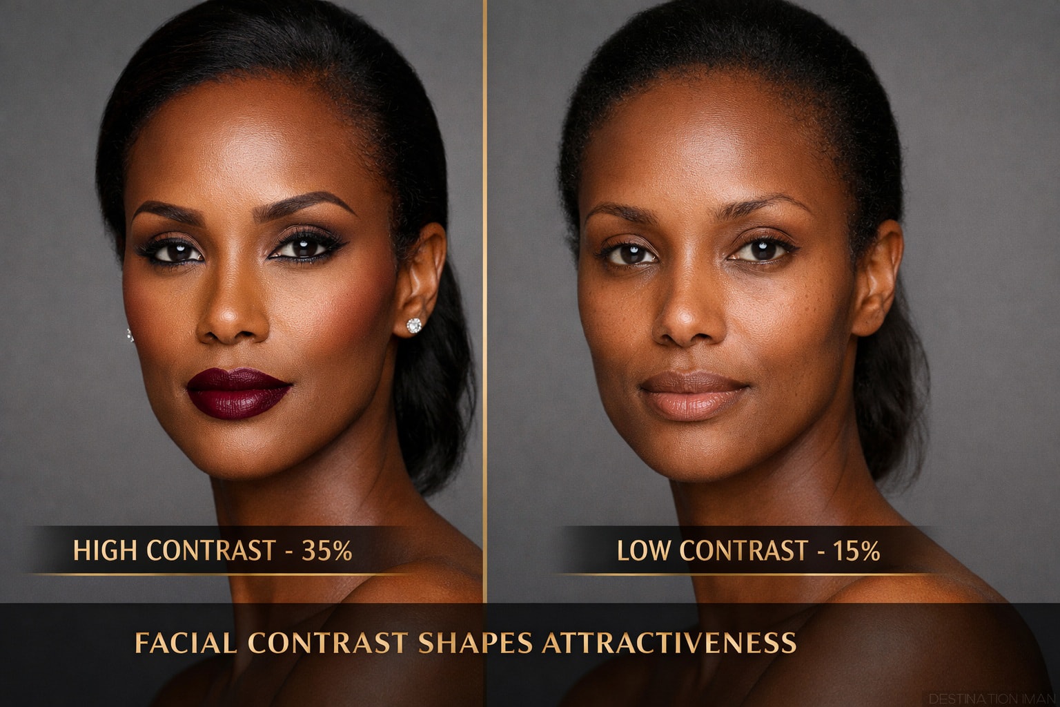
Facial Contrast Theory: The Science Behind Makeup
One of the most important discoveries in color psychology and beauty is facial contrast theory—the principle that attractiveness correlates with the degree of contrast between facial features (eyes, lips, eyebrows) and skin.
What Is Facial Contrast?
Facial contrast measures the difference in luminance (lightness/darkness) and chrominance (color saturation) between facial features and surrounding skin. High contrast makes features stand out; low contrast makes features blend into the face.
Why Facial Contrast Matters
- Youth indicator: Facial contrast decreases 20-30% between ages 20 and 50
- Femininity marker: Women naturally have higher facial contrast than men
- Attention magnet: High-contrast features draw eye gaze and hold attention longer
- Makeup mechanism: Makeup increases facial contrast artificially, restoring youthful appearance
- Cross-cultural universal: Facial contrast preference appears across diverse cultures
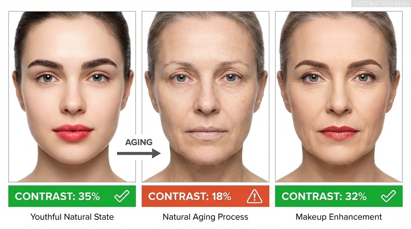
The Optimal Facial Contrast Range
How Aging Reduces Facial Contrast
As people age, facial contrast naturally diminishes through multiple mechanisms:
- Lip color fades: Reduced blood flow and collagen depletion lighten lip color
- Skin tone evens out: Loss of differentiation between features and skin
- Brow hair thins: Eyebrows become lighter and less defined
- Under-eye darkening: Increased pigmentation and thinning skin create shadows
- Skin redness decreases: Reduced microcirculation leads to paler complexion
Makeup's primary function is to artificially restore the facial contrast that naturally decreases with age—explaining why makeup makes wearers appear younger and more vibrant.
Emotional Responses to Color
Colors carry powerful emotional associations that influence first impressions, perceived personality, and attractiveness long before logical evaluation occurs.
Primary Color Associations
Core Color Psychology in Beauty
- Red: Passion, energy, dominance, sexual attraction, excitement, danger, warmth
- Blue: Calm, trust, stability, competence, coolness, introspection, sadness (context-dependent)
- Black: Power, elegance, mystery, authority, sophistication, rebellion, formality
- White: Purity, simplicity, freshness, cleanliness, innocence, minimalism, clinical
- Pink: Femininity, softness, romance, playfulness, youth, approachability, sweetness
- Earth tones (brown, beige, tan): Warmth, stability, approachability, naturalness, comfort
- Gold/Yellow: Luxury, optimism, energy, attention-grabbing, warmth, creativity
- Green: Nature, health, balance, growth, freshness, harmony, envy (context-dependent)
- Purple: Royalty, luxury, spirituality, creativity, mystery, sophistication
Contextual Color Meaning
Importantly, color meaning depends heavily on context. Red in a romantic setting signals passion; red in a professional setting may signal aggression or dominance. The same color can communicate different messages depending on surrounding colors, cultural context, and situational framing.
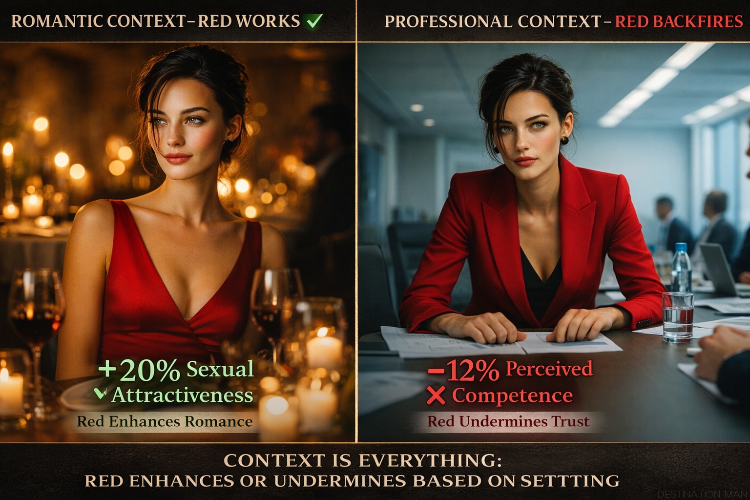
The Red Dress Effect: Science & Myths
Perhaps the most famous color-beauty phenomenon is the red dress effect—the finding that wearing red enhances sexual attractiveness. But recent research reveals the effect is more nuanced than popular media suggests.
The Original Red Effect Research
Early studies (2008-2010) found that men rated women wearing red as more sexually attractive than women wearing other colors (blue, green, white). Researchers proposed evolutionary explanations: red signals ovulation, arousal, and reproductive readiness in primates; humans inherited this association.
2024-2026 Research: The Red Effect Revisited
When Does Red Work?
Conditions for the Red Dress Effect
- Romantic context: Red boosts attraction at social events, dates, and intimate settings
- Feminine features: Red amplifies attractiveness for women with high facial femininity
- Opposite-sex evaluation: Red works when being evaluated by potential romantic partners
- Cultural familiarity: Effect strongest in Western cultures where red=romance association is strong
When Does Red Backfire?
Red for Men
Interestingly, the red effect is not gender-specific. Research shows men wearing red are also rated as more attractive, dominant, and sexually desirable—particularly by women evaluating them in romantic contexts.
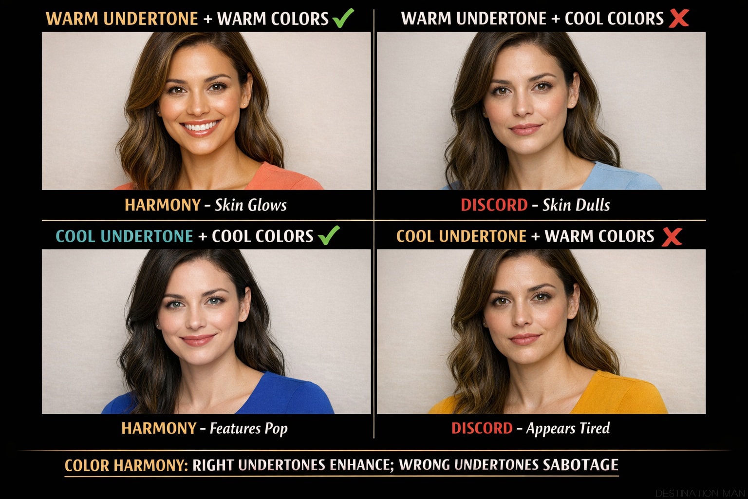
Seasonal Color Analysis: The Science of Undertones
Seasonal color analysis (also called "color season theory") classifies individuals into color categories based on their natural coloring—primarily skin undertone, hair color, and eye color. The system helps identify which clothing and makeup colors create harmony versus discord with one's natural palette.
The Science Behind Seasonal Color Analysis
Understanding Undertones
Undertone refers to the subtle hue beneath the surface of your skin. It remains constant regardless of tanning, sun exposure, or aging.
Three Undertone Categories
- Warm undertones: Golden, yellow, or peachy hues; veins appear greenish; gold jewelry flatters more than silver
- Cool undertones: Pink, red, or bluish hues; veins appear bluish; silver jewelry flatters more than gold
- Neutral undertones: Balanced mix of warm and cool; neither gold nor silver clearly dominates; widest color palette flexibility
The 12-Season System
Modern seasonal color analysis uses a 12-season system that categorizes individuals based on three dimensions:
- Hue: Warm vs Cool (underlying temperature)
- Value: Light vs Dark (overall lightness/darkness of natural coloring)
- Chroma: Muted vs Bright (saturation/intensity of natural coloring)
Why Color Harmony Works
The reason seasonal color analysis "works" lies in processing fluency and cognitive ease. When colors harmonize with your natural coloring:
- Brain processes the visual information more fluently (less cognitive effort)
- Reduced cognitive load creates positive emotional response
- Harmonious colors direct attention to face rather than clothing
- Skin appears more radiant due to favorable color reflection/contrast
Discordant colors create the opposite effect: increased cognitive effort, negative emotional response, and attention drawn to the wrong color rather than the person's face.
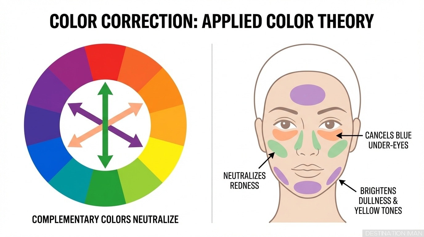
Color in Makeup and Facial Perception
Makeup is fundamentally a color-manipulation technology. It alters facial perception by adjusting color relationships—increasing contrast, correcting undertones, and strategically directing attention.
How Makeup Uses Color
Makeup Color Strategies
- Increase facial contrast: Darken lips, eyes, brows to restore youthful contrast
- Color correction: Use complementary colors to neutralize unwanted tones (green conceals redness; peach conceals blue under-eyes)
- Skin tone evening: Foundation creates uniform base, reducing blemishes and uneven pigmentation
- Highlight and shadow: Light/dark contouring mimics bone structure through color illusion
- Attention direction: Bold lip color draws gaze to mouth; bold eye makeup draws gaze to eyes
- Undertone enhancement: Warm-toned makeup enhances warm undertones; cool-toned enhances cool
The Natural Makeup Paradox
This explains the popularity of "no-makeup makeup"—techniques that increase facial contrast and correct color imperfections while remaining invisible to casual observation.
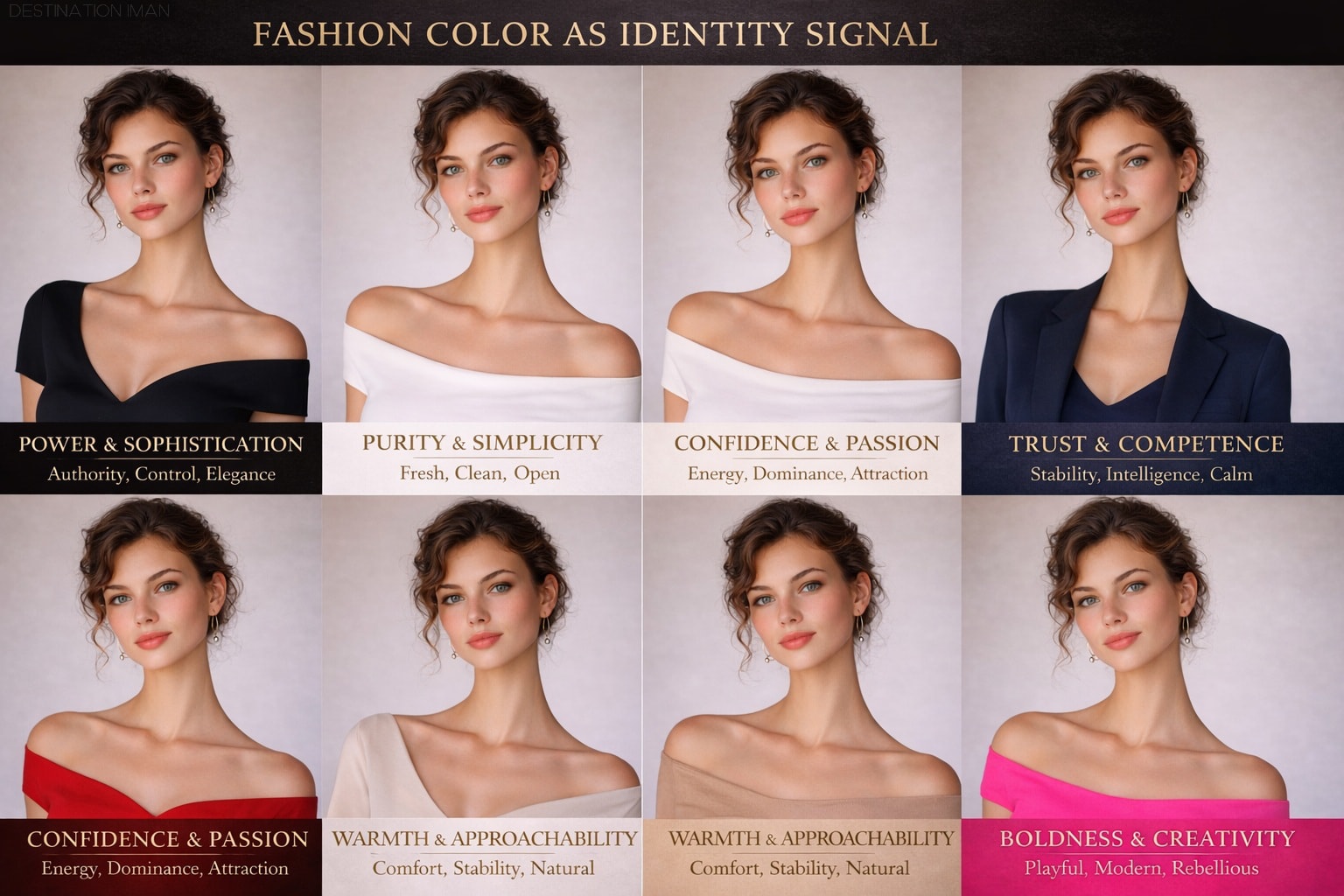
Color in Fashion and Style
In fashion, color serves as a powerful identity signal. Clothing color influences how confident, approachable, authoritative, creative, or trustworthy a person appears—often overriding other visual cues.
Color and Perceived Personality
Fashion Color Psychology
- Black: Authority, sophistication, control, formality, mystery, elegance
- White/Cream: Purity, simplicity, cleanliness, minimalism, freshness, openness
- Navy blue: Trust, competence, stability, professionalism, calm, intelligence
- Red: Confidence, passion, power, attention-seeking, dominance, energy
- Earth tones: Approachability, warmth, stability, naturalness, comfort, reliability
- Pastels: Softness, femininity, gentleness, approachability, youth, calm
- Neon/bright: Creativity, boldness, playfulness, attention-seeking, modernity, rebellion
- Monochrome: Control, confidence, minimalism, sophistication, intentionality
Fashion Color Trends 2025-2026
Monochrome vs High-Contrast Fashion
Monochrome outfits (single color or tight color range) signal control, sophistication, and intentionality. They reduce visual noise, creating clean, powerful silhouettes.
High-contrast combinations (black + white; complementary colors) draw attention, signal energy, and create visual drama. They're attention-grabbing but can feel overwhelming if overused.
Contrast, Harmony, and Balance
The brain responds most positively to balanced color relationships—neither too chaotic nor too monotonous. Understanding the principles of color contrast and harmony reveals why certain combinations feel "right" while others feel discordant.
Types of Color Harmony
Color Harmony Principles
- Complementary: Opposite colors on color wheel (red/green, blue/orange); create maximum contrast and visual energy
- Analogous: Adjacent colors on wheel (blue/blue-green/green); create smooth, harmonious transitions
- Triadic: Three evenly spaced colors (red/yellow/blue); create balanced, vibrant combinations
- Monochromatic: Variations of single color (different shades/tints); create cohesive, calm aesthetic
- Split-complementary: Base color plus two adjacent to complement; balanced yet dynamic
Contrast Levels and Emotional Impact
- High contrast: Energizing, attention-grabbing, dramatic, sometimes aggressive or overwhelming
- Medium contrast: Balanced, engaging, comfortable, universally appealing (optimal range)
- Low contrast: Calming, subtle, sophisticated, risk of appearing dull or lifeless
This principle parallels facial contrast theory: moderate contrast creates maximum aesthetic appeal. Too little feels boring; too much feels chaotic.
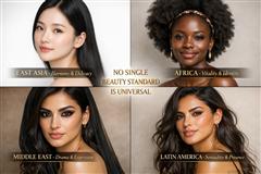
Color and Cultural Differences
While some color associations appear universal (red = arousal/energy; blue = calm), many are culturally constructed. Understanding cultural color symbolism is essential for interpreting global beauty standards.
Cultural Color Symbolism
Cross-Cultural Color Meanings
- Red: Western = passion/romance; Chinese = luck/prosperity; some African = mourning; Indian = purity/fertility
- White: Western = purity/weddings; Asian = mourning/death; Middle Eastern = purity/mourning (context-dependent)
- Black: Western = sophistication/formality/death; many cultures = power/authority; some African = maturity
- Yellow: Western = caution/optimism; Asian = royalty/sacred; Latin America = death/mourning (some contexts)
- Green: Islamic cultures = sacred/paradise; Western = nature/envy; Celtic = luck
- Blue: Nearly universal = calm/trust; some Middle Eastern = protection from evil eye
These cultural differences explain why beauty standards and fashion norms vary dramatically across regions—color meaning shapes what is considered attractive, appropriate, or desirable in specific cultural contexts.
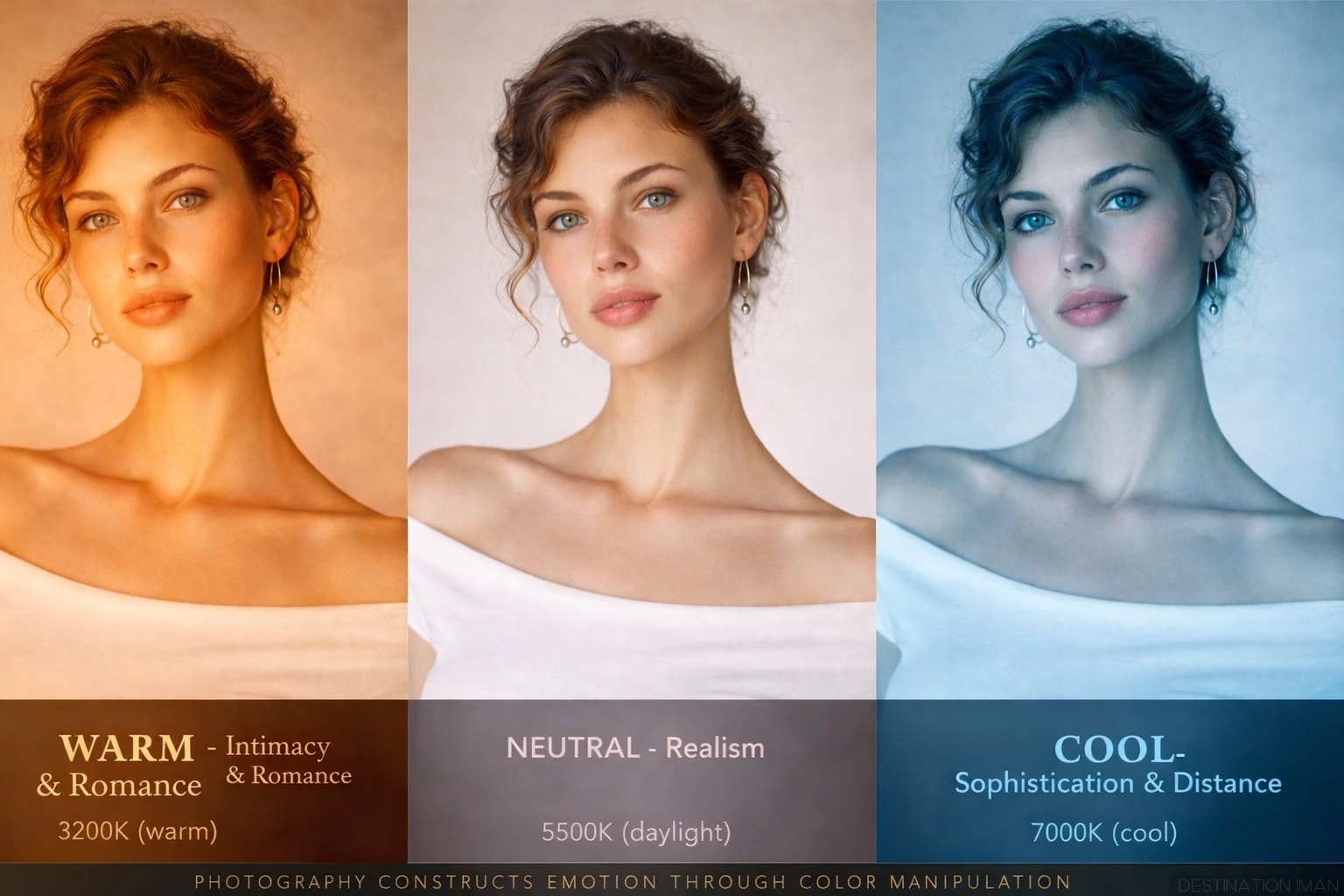
Color in Media and Photography
Photography and film use color grading—deliberate manipulation of color temperature, saturation, and contrast—to guide emotional response and construct beauty narratives.
Color Grading Emotional Strategies
Color Grading Techniques in Beauty Media
- Warm, golden grading: Signals intimacy, romance, nostalgia; used in beauty ads and lifestyle content
- Cool, desaturated grading: Signals sophistication, minimalism, high fashion; editorial photography
- High saturation: Energetic, youthful, playful; social media beauty content
- Low saturation (muted): Luxury, refinement, maturity; high-end beauty campaigns
- Teal-and-orange: Cinematic "blockbuster" look; creates depth through complementary contrast
Instagram Filters and Unrealistic Standards
Understanding that media beauty is color-constructed rather than naturally occurring can help viewers develop critical media literacy and resist unrealistic standards.
Key Takeaways
Essential Insights: Color Psychology and Beauty
- Brain processes color 2-3x faster than facial features—color creates first impressions before identity recognition
- Color activates brain reward circuits (ventral striatum, vmPFC), explaining why certain colors feel inherently pleasurable
- Facial contrast theory: 30-40% contrast between features and skin creates optimal attractiveness
- Facial contrast decreases 20-30% between ages 20-50; makeup restores contrast artificially
- Red dress effect enhances sexual attractiveness in romantic contexts but backfires in professional settings
- Red effect only works for women with high facial femininity; amplifies existing cues rather than creating attraction
- Seasonal color analysis works through processing fluency—harmonious colors require less cognitive effort, creating positive response
- Right colors enhance perceived health by 20-30%; wrong colors create shadows and emphasize imperfections
- Makeup is fundamentally color manipulation: increasing contrast, correcting undertones, directing attention
- Natural makeup processes more fluently than heavy makeup; "no-makeup makeup" optimal
- Fashion color signals identity: black = power, white = purity, navy = trust, red = confidence
- 2025-2026 trends: Hues of Brown (stability) and Plum (sophistication) reflect collective emotional needs
- Color harmony reduces cognitive load by 25-40%, creating positive emotional response
- Medium contrast (moderate difference) universally most appealing—neither boring nor chaotic
- Color meaning is partially universal (red = arousal) but heavily culturally constructed
- Media uses color grading to manipulate emotion: warm = intimacy, cool = distance
- Instagram filters create unrealistic color standards, training perception on artificial beauty
- Understanding color construction enables critical media literacy and resistance to unrealistic standards
Sources & References
Academic & Research Sources (2024-2026)
- bioRxiv (2025) — Subliminal Beauty Engages the Brain's Valuation Circuits
- Nature (2021) — Human Brain Activity Reflecting Facial Attractiveness from Skin Reflection
- Frontiers in Psychology (2025) — Simulated Intra-Individual Skin Color Changes and Their Impact on Attractiveness
- Cosmora (2025) — Medium Contrast Makeup 2025: Complete Guide
- Study Finds (2025) — How Your Brain's Energy Budget Shapes What You Like
- Normal Curves Podcast (2025) — The Red Dress Effect: Are Women in Red Sexier?
- ScienceDirect (2024) — Contextual Modulation of the Red-Attractiveness Effect
- PMC (2023) — Red is Romantic, but Only for Feminine Females
- IED News (2025) — Colour Analysis: The Science of Colours in Personal Styling
- The Funky Zebra (2025) — The Science of Seasonal Color Analysis
- Color Analysis App (2025) — A Deep Dive into the 12 Color Season System
- Heuritech (2025) — Key Colors 2025-2026: The Ultimate Trend Breakdown
- Sensient Beauty (2024) — Colors Trends of 2025/2026: Exploration of Emotions
- BeautyMatter (2025) — How Beauty Brands Use Colors to Inspire, Influence, and Sell
- Noam Kroll — The Psychology of Color Grading & Its Emotional Impact
- No Film School (2023) — The Psychology of Color in Film (with examples)
- Film Colorist (2025) — The Psychology of Color Grading: A Look at Color Theory in Action
- Elliot, A. J., & Maier, M. A. (2014). Color Psychology: Effects of Perceiving Color on Psychological Functioning in Humans. Annual Review of Psychology.
- Heller, E. (2009). Psychology of Color: Effects of Color on Human Behavior. Penguin Books.