Introduction: The Paradox of Simple Luxury
In design, fashion, and visual culture, an enduring paradox persists: the simpler something appears, the more valuable it feels.
From minimalist architecture to understated couture, from Bauhaus furniture to Apple's restrained product design — simplicity has become the contemporary language of luxury. Yet this simplicity is neither accidental nor effortless. It is the result of rigorous discipline, exceptional materials, and a confidence that allows empty space to speak.
Why does restraint signal expense? Why do we perceive intentional emptiness as abundance? And what separates true simplicity from mere plainness?
This editorial examines the visual, psychological, and historical forces that make simplicity expensive — not despite its lack of ornament, but precisely because of it.
The Cost of Less
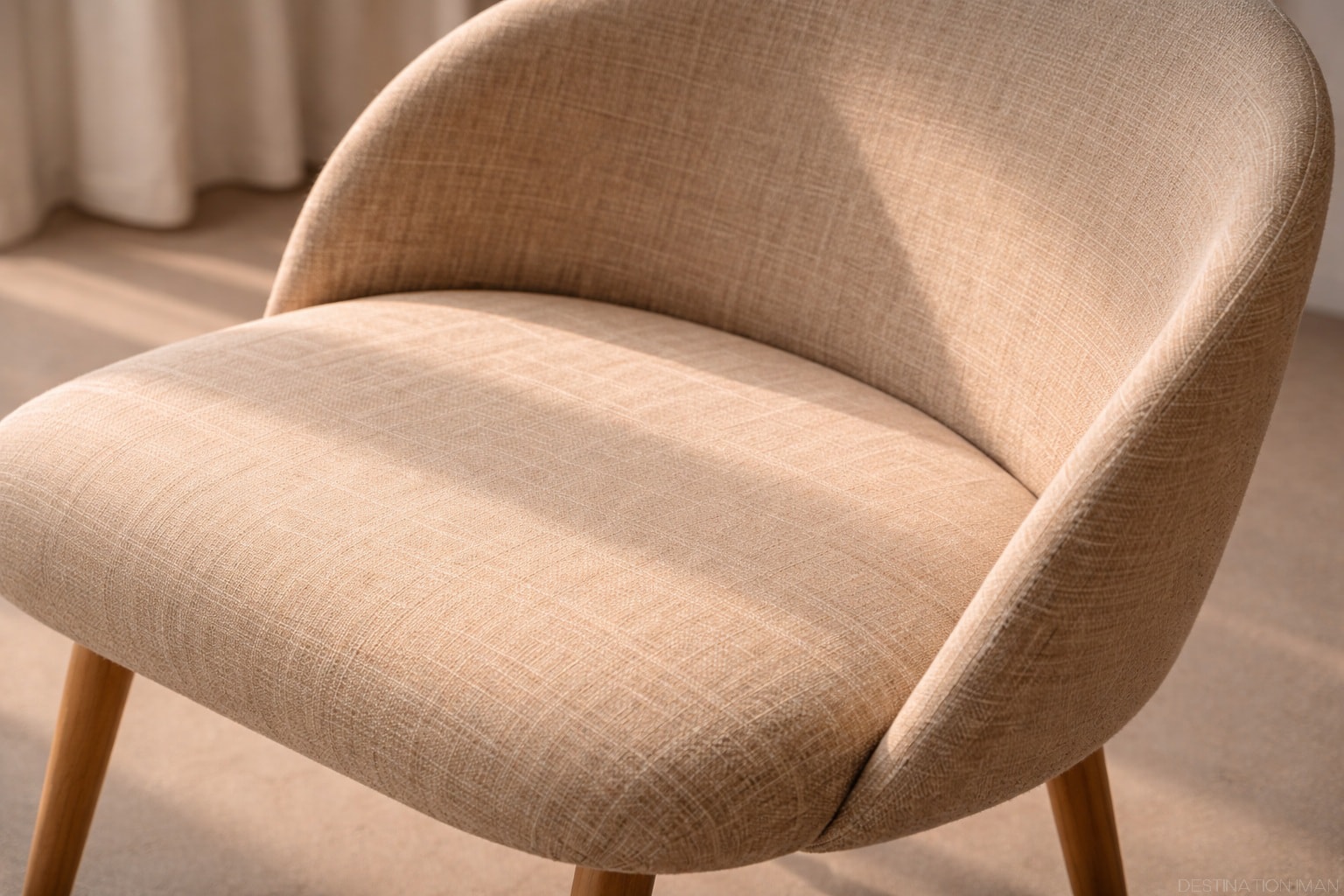
At first glance, simplicity might appear effortless. In reality, creating something truly simple is an exercise in precision and relentless refinement. Every line must be intentional. Every proportion must be exact. Nothing can hide behind decoration.
The process demands superior materials and flawless execution. When there is no ornamentation to distract the eye, imperfections become immediately visible. A poorly finished seam on a minimalist garment is glaringly obvious; the same flaw might disappear beneath embroidery or ruffles.
"Perfection is achieved not when there is nothing more to add, but when there is nothing left to take away."
— Antoine de Saint-Exupéry
Consider the craftsmanship behind a Scandinavian oak table or the construction of a perfectly tailored black coat. Both rely on material quality and structural integrity alone. The wood must be flawless; the cut must be precise. Simplicity reveals truth.
Visual Principles: Why Simplicity Pleases the Eye
The appeal of simplicity is not arbitrary. It aligns with fundamental principles of visual perception and cognitive processing.
Gestalt Principles and Visual Clarity
Our brains seek order and pattern. Minimalist design satisfies this instinct by presenting clear hierarchies, balanced compositions, and unambiguous focal points. The eye moves smoothly across a simple form without confusion or fatigue.
The Golden Ratio and Proportion
Many minimalist designs unconsciously echo mathematical harmony — proportions that feel inherently "right" because they mirror patterns found in nature. When form serves function without excess, these proportions emerge naturally.
Negative Space as Active Element
In minimalist composition, empty space is not absence — it is presence. Negative space frames, emphasizes, and allows breathing room. It transforms surrounding elements into focal points without competition.

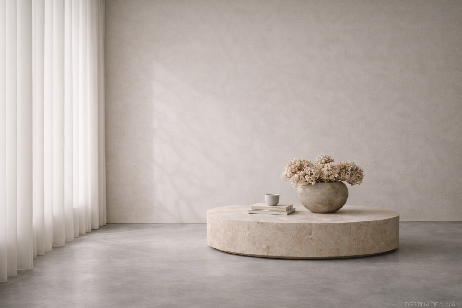
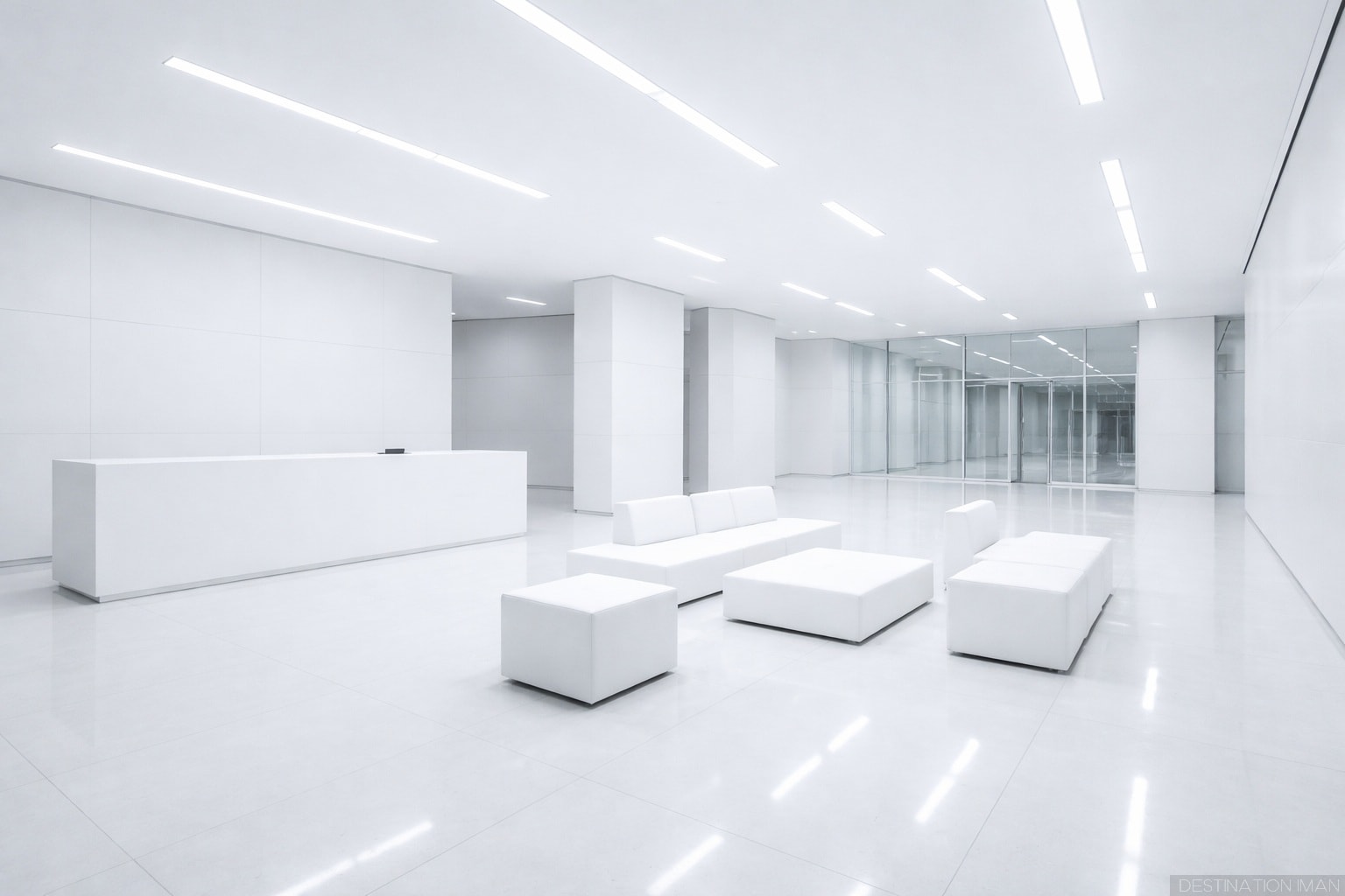
The Luxury of Space
Space — both physical and visual — has become the ultimate luxury.
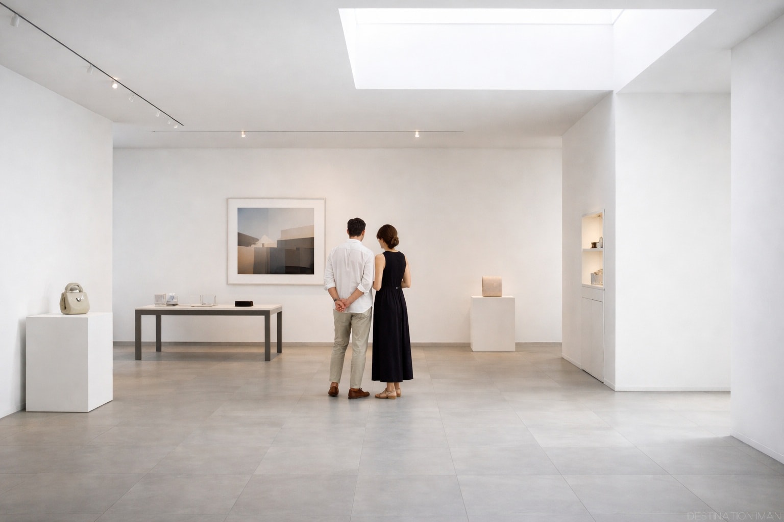
In retail environments, brands like Apple, Aesop, and high-end galleries understand that abundance of space signals confidence and exclusivity. Their stores feature minimal product displays, generous spacing, and uncluttered surfaces. This emptiness communicates that neither the brand nor its customers need to compete for attention.
The same principle applies to packaging, websites, and print design. White space is expensive because it represents choice — the deliberate decision not to fill every available inch. In contexts where real estate is costly (Manhattan storefronts, magazine spreads, premium websites), leaving space empty becomes a bold assertion of value.

Exclusivity Through Restraint
Luxury brands understand that abundance dilutes value. Offering fewer choices — or creating designs with minimal embellishment — suggests selectiveness and intentionality.
A single well-cut coat stands out when surrounded by racks of fast-fashion alternatives covered in logos, patterns, and decorative details. It whispers exclusivity instead of shouting for notice.
This restraint extends to branding. The most confident luxury houses — Hermès, Bottega Veneta, The Row — often feature understated or absent logos. The product speaks for itself. Those who know, know. Those who don't are not the intended audience.
Simplicity as Status: From Baroque to Minimalism
The Historical Shift
Historically, ornate design signaled wealth. Baroque palaces, Rococo interiors, and Victorian fashion displayed prosperity through elaborate decoration — gold leaf, intricate carvings, layers of embellishment. Only the wealthy could afford such displays of artisanal labor.
The 20th century inverted this relationship. Modernism, Bauhaus, and later movements like Scandinavian design positioned simplicity as the new refinement. "Less is more" became a philosophical stance, not just an aesthetic preference.
Dieter Rams and Functional Beauty
Designer Dieter Rams articulated principles that continue to define luxury minimalism:
- Good design is innovative
- Good design is unobtrusive
- Good design is honest
- Good design is long-lasting
- Good design is as little design as possible
These principles influenced Apple, Muji, and countless contemporary brands. Restraint became a marker not of poverty, but of discernment.
Contemporary Luxury: Quiet Confidence
Today's elites signal status differently than previous generations. True luxury now lies in discretion — quiet confidence that requires no explanation. Wealth is demonstrated through quality of life (time, space, experiences) rather than ostentatious display.
This shift reflects evolving cultural values. Those who can afford more may deliberately choose less as an assertion of taste, environmental consciousness, or philosophical alignment.
The Psychology Behind Perception
Cognitive Fluency and Trust
Cognitive research reveals that we equate visual clarity with quality and reliability. Clean, uncluttered designs process more easily, creating positive associations. Clutter, by contrast, triggers cognitive load and often signals cheapness or disorganization.
The Halo Effect of Intentionality
Minimalist design suggests that every element exists by deliberate choice rather than accident. This perceived intentionality creates a "halo effect" — we assume that if the visual presentation is carefully considered, the underlying product or service must be equally thoughtful.
Mystery and Desire
When brands resist filling every available space — physical, visual, or informational — they create an aura of mystery. What is not shown becomes as important as what is revealed. This restraint stimulates curiosity and projects confidence.
Luxury thrives on desire, and desire requires distance. Simplicity maintains that distance by refusing to explain itself fully.
Case Studies in Simple Luxury
Fashion: Chanel vs. Fast Fashion
A classic Chanel jacket — minimal branding, clean lines, impeccable construction — commands thousands of dollars. A fast-fashion imitation covered in obvious logos sells for tens. The difference lies not just in materials, but in restraint. True luxury does not announce itself.
Technology: Apple's Design Language
Apple's success is inseparable from its minimalist aesthetic. Clean packaging, intuitive interfaces, products reduced to essential forms. This simplicity is expensive to achieve — it requires engineering precision, material innovation, and unwavering design discipline.
Architecture: Tadao Ando and Concrete Minimalism
Japanese architect Tadao Ando creates spaces of profound simplicity using concrete, light, and geometry. His buildings feel expensive precisely because they strip away everything nonessential, leaving only spatial experience and material truth.
Beauty: Aesop and Apothecary Minimalism
Skincare brand Aesop uses amber bottles, minimalist labels, and restrained store design. The aesthetic communicates botanical purity and pharmaceutical precision — luxury through understatement rather than glamour.
When Simplicity Fails
Not all minimalism succeeds. Simplicity fails when it becomes sterile, inaccessible, or performative rather than functional.
Sterility vs. Warmth
Effective minimalism retains warmth — through texture, light, or human presence. Cold, clinical simplicity can feel alienating rather than luxurious. The difference often lies in material choice and sensory detail.
Exclusion vs. Refinement
When minimalist aesthetics are used to signal exclusivity at the expense of accessibility or functionality, they become performative. "Gentrification aesthetics" — all-white interiors, sparse signage, intimidating emptiness — can communicate gatekeeping rather than sophistication.
Emptiness vs. Intention
There is a meaningful difference between intentional restraint and mere emptiness. True simplicity requires that what remains carries weight. If simplicity leaves nothing worth contemplating, it becomes void rather than refined.

Conclusion: Mastering What to Leave Out
Simplicity looks expensive because it is expensive — not in monetary terms alone, but in discipline, skill, material quality, and cultural awareness.
It requires knowing not just what should be added, but what should be left out. It demands confidence to let space speak, restraint to resist decoration, and precision to ensure that every remaining element is flawless.
In business, design, fashion, and life, mastering simplicity means understanding luxury's contemporary codes: that less can communicate more, that silence can be louder than noise, and that true value often whispers rather than shouts.
As we explored in our examination of timeless beauty, enduring forms share a common trait — they know when to be silent. Simplicity is not absence. It is the presence of intention, refined to its essence.